If you want to see results from your digital ad campaigns, you need to make sure your landing page design is working hard to convert your online users into customers. When people get excited by your ads and click through to your site, they are entering an important next stage within your conversion funnel. When implemented correctly, a well-designed landing page can turn up the temperature and transform that lukewarm lead into a hot-fire sales opportunity.
Landing Pages Best Practices
Throughout this blog, we explore several key landing page design concepts that will empower you to build better landing pages. Our aim is to help enhance your overarching online strategy, in the spirit of making your ads more awesome and your business more successful.
Make a good first impression
One thing you can do to promote the visual organization of your landing page is to avoid using a top menu. Once the eagle has landed, you do not want to skew their bird’s eye view of your convincing copy, so create a design that removes the top menu and reduces the likelihood your potential customer will fly the coop to a less relevant page.
While the top menu has to go, what certainly needs to stay and take up key real estate is your logo. People need to know whose business they are buying into and your logo is a fundamental part of the design cohesiveness that will convince them you are a brand worth paying attention to (and paying for).
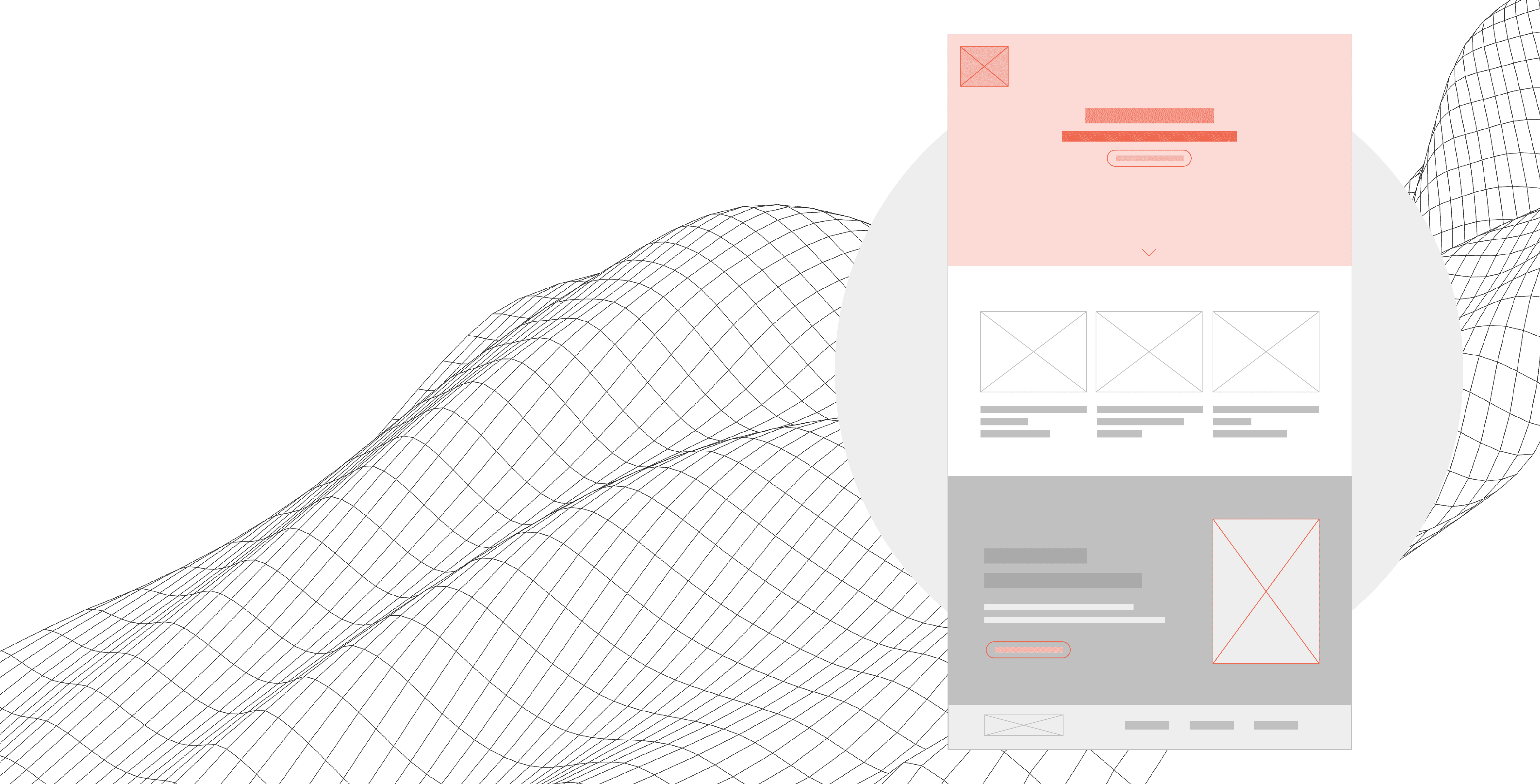
Right off the hop, you need a landing page header that pops. Keep it simple, but make sure your header section has these four elements:
- Explanatory copy: these are the nuts and bolts as to why your reader needs to care about what’s on your landing page. To avoid confusion and boost conversions, this copy should seamlessly build on the ad content they’ve just clicked through from.
- CTA/Form: Your landing page should be built to generate sales leads. If you are missing the spot where you tell your audiences to “learn more”, “sign up” or “take advantage of blah and blah promotion”, you have already cut yourself off at the conversional knee and rendered – what should be a key selling tool – into just another handsome page.
- Brand image: Your brand image is the microphone that amplifies your messaging. Feature this key collateral prominently to turn up the volume on your brand desirability.
- Service or product reference: Here is another landing page design best practice that seems obvious yet is often overlooked. You’ve built the page and the people have come: make sure they know why they should stick around with clear, concise copy that differentiates your products/services from the masses.
Create a synergy between your ads and your landing pages
One of the most important elements of your fast-track conversion funnel will be your audience’s sense of branding cohesiveness. You’ve put in the effort to come up with some really engaging ads. They are sassy, they are classy and, most importantly, they have encouraged your target human being to click.
Once that mouse has landed on your call to action, your landing page needs to demonstrate that whatever won the user over in the ad is being fulfilled in the next stage of your conversion funnel. Using consistent design concepts, colours and copy will ease your customer’s transition from ad to a landing page and significantly increase their sense of comfort with converting.

Less is more
Your landing page design elements and copy need to be concise, so people don’t get distracted. In the era of short attention spans, you want to avoid too many decorative flourishes or wording that does not act as a persuasive push towards your call to action.
Make your call-to-action the star of the show
Speaking of your conversional superstar, your main protagonist needs to be your lead generation form or call to action. Landing page best practices dictate that regardless of how beautiful and convincing they are, the rest of your page elements are supporting characters to your CTA.
These co-stars are there to make the protagonist shine, so make your form pop with eye-catching colours and an emotively engaging statement or provocative question that makes people stop, think and take the desired action.

Keep the fonts clean
When deciding whether to leverage serif or non-serif fonts, it certainly does not need to be an all-or-nothing situation. But, as we’ve said above, it’s important to keep your landing page clean. So, don’t overdo it with the serifs and ensure there is a strategic balance amongst your fonts to enhance key messages and visual consistency.
Spacing and size
Having good spacing between lines and between characters really makes a difference when designing a landing page. Try to avoid having just one font-weight throughout or it will turn into a long newspaper column rather than an interactive site.
Mix fonts to create a more dynamic page, but keep in mind that three or more can be a crowd and cause readers to feel overwhelmed yet underinformed. This landing page design faux pas may cause them to click “I don’t” and move on from your landing page

Use Device-Specific Design
With nearly 80% of smartphone users making purchases on their mobile devices, now is not the time to force them to interact with a make-fit landing page that lacks mobile responsiveness. Fully customize your design to align with mobile landing page best practices, including legible fonts, the removal or adjustment of particular images and the avoidance of excess copy.
Choose the perfect colors
Colour is the perfect way to highlight elements within your landing page design. But, using too many colours or ones that clash is a quick way to chase your potential customers off your site. Make savvy colour choices that create aesthetically appealing contrasts. Equally as important, avoid creating a starkly clinical vibe with too much white or accidentally scaring away your customers with the usage of the ominous absolute black.
Use directional cues and interactive elements to keep users engaged
Think of your landing page like a road map to your CTA, with the design and copy acting as directional cues leading the way towards the ultimate pitstop. Strategically incorporating these elements will make a lasting impression on your visitors:
- Use graphic elements: Photos, products and mock-ups help create good flow to the finish line.
- Avoid boxes: Alternatively, use organic-shaped elements to make your landing page more visually interesting and encourage scrolling.
- Break the fourth wall: Having elements that feel like they are ‘coming out of the screen’ will shake up the pace of your landing page and enhance engagement.

Add icons and graphics to explain complex information
Visuals help information travel along your cognitive highway faster than copy alone. Drive home key points about your products or services by incorporating well-placed, well-thought-out icons and graphics. Don’t overdo it with fluff but create focal points and clarify messaging with a visual that says, “This is exactly what we’re talking about and why you should care.”

A/B test certain elements
Your landing page isn’t set-it-and-forget-it. With A/B testing, you can determine which elements are working and which can be improved upon to enhance your conversion rate. You will be surprised to see which small changes can make big differences in terms of promoting the cost-effectiveness of your ad campaigns.
Follow these do’s & don’ts for landing page design and see how it affects your bottom line
All the above may seem like a lot to consider for a singular webpage. But, smart online marketers recognize that putting in the TLC to create something great is fundamental in maintaining a solid ROI. Don’t just throw money at a digital ad campaign without first investing in a landing page that will land well with your audiences. A superior landing page will support your overarching digital strategy and directly affect how many online users are motivated to complete your call to action.
If you aren’t sure how best to implement these landing page best practices, reach out to our team at Bloom and we will take the guesswork out of growing your online presence.
Subscribe to The Shift Factor
Our newsletter keeps you in the know on marketing’s biggest shifts and real examples of brands adapting.


Share this: