This article was updated in February 2025
Back in 2019, we first wrote this article to break down the best practices for display ads. Fast forward to 2025, and while some things have changed, some haven’t—so we decided it was time for an update to keep this guide as useful and relevant as possible.
With so many advertising options out there, display ads sometimes get written off as old-school. But here’s the thing: they’re still a key player in digital marketing, especially when it comes to building brand awareness, retargeting potential customers, and supporting other digital tactics.
Over the years, our digital marketing agency has managed hundreds of Google Ads display campaigns, giving us a solid understanding of what works and what doesn’t. Whether you’re advertising through Google Ads, DV360, or investing in premium direct buys with top publishers, the same core principles apply: your display ads need to stand out, be engaging, and drive action.
So, do display ads still matter in 2025? Absolutely. And, let’s dive into 14 best practices to help you design high-performing display ads—no matter which platform you’re using.
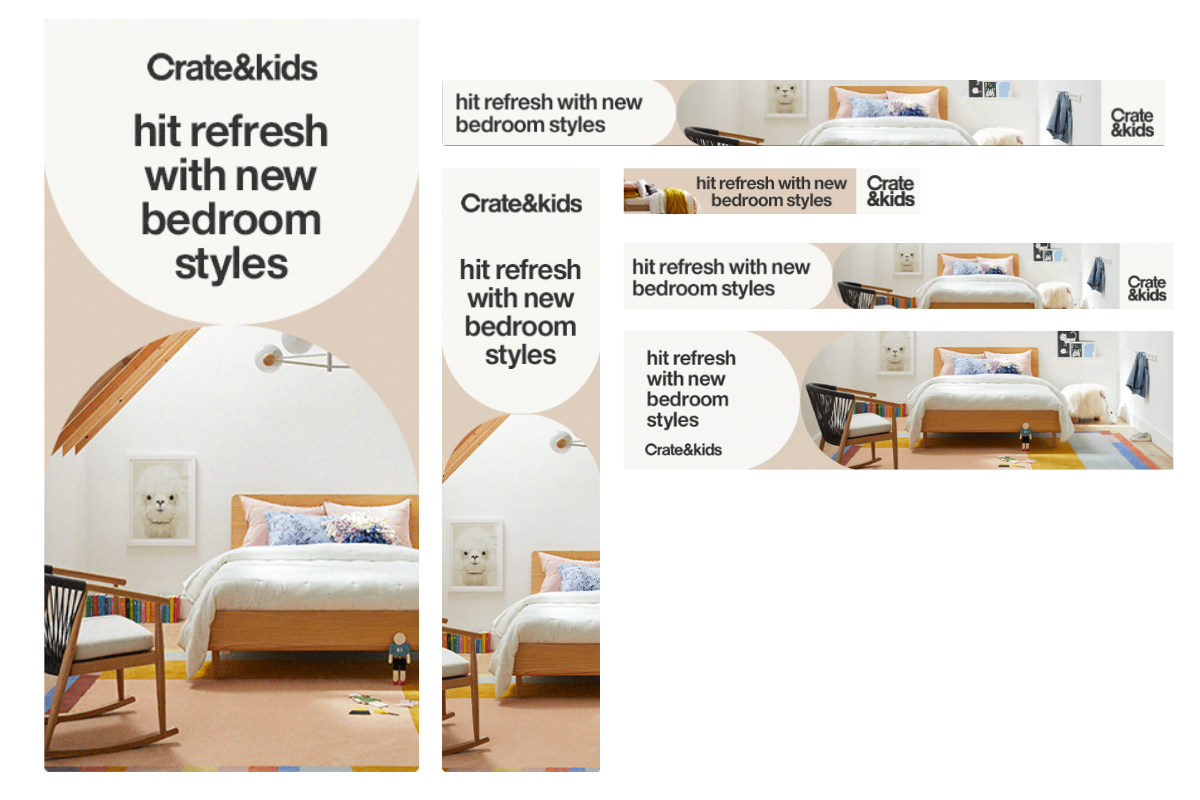
1. Create Multiple Formats
There are over 40 display ad formats on the Google Network. The more ad formats you include in your mix, the more opportunities for ad impressions you get. That being said, creating multiple variations of your banner in all the available sizes can be time-consuming. We’d recommend focusing on the standards and most effective banner sizes available (the top 10 performing banners sizes make up 90% of impressions in the Google Ads Network).
Top-performing ad sizes according to Google:
- Large Rectangle: 336 × 280
- Inline rectangle: 300 × 250
- Half Page: 300 × 600
- Large Mobile: 320 × 100
- Leaderboard: 728 × 90
If you have the resources available, we also recommend testing these banner sizes:
- Mobile: 320 × 50
- Wide skyscraper: 160 × 600
- Main Banner: 468 × 60
- Large leaderboard: 970 × 90
2. Use Responsive Display Ads
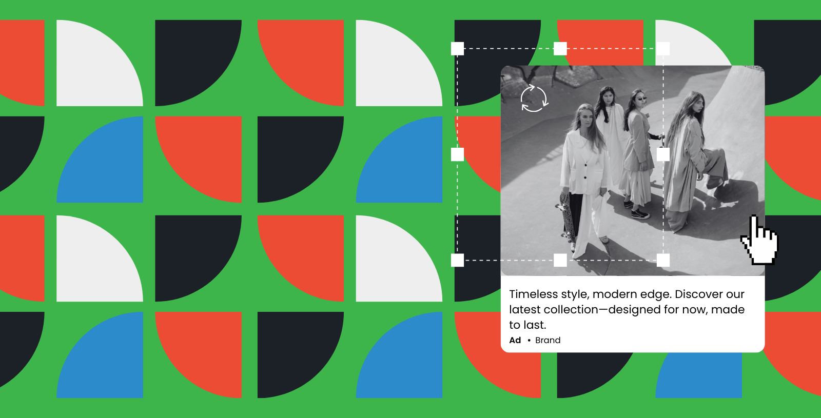
In 2025, Responsive Display Ads (RDAs) are a no-brainer. They allow Google Ads to dynamically assemble your images, logos, headlines, and descriptions to fit different ad placements.
While you lose some control over the final look of your ad, RDAs let you launch display campaigns in seconds—without extensive help from a graphic designer. Plus, they expand your reach since they automatically adapt to the placements available across ad networks.
When working with Responsive Display Ads, avoid embedding logos in images, minimize overlay text, avoid overlay buttons, ensure your product is the main visual element. Also, add as many headlines and descriptions as you can, as seen in Roots’ campaign, testing variations helps identify what resonates best with your audience.

If you’re running Performance Max (PMax) campaigns, the approach is the same: you upload your creative assets, and Google’s AI optimizes their distribution. For this format, it’s best to have both text-free and text-overlay versions of your visuals in square, horizontal, and vertical ratios.
So, is it still worth creating “traditional” display ads? Absolutely. Like any marketing tactic, it’s always smart to test different formats and see what works best for you.
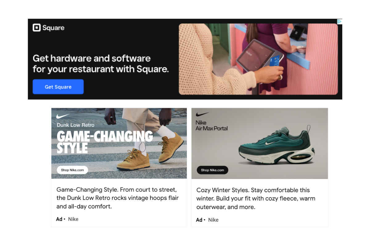
3. Add Your Logo
Most of the time, the main purpose of display advertising is to increase brand awareness and drive more traffic to your website. In order to build brand awareness, your company logo should be included in the ad, and clearly visible.
Both Square and Nike provide strong examples of effective logo placement in display ads.
Square ensures brand visibility by placing its logo in the top left corner, aligning with the natural reading pattern. Additionally, the brand name is reinforced in both the ad copy (“with Square”) and the CTA (“Get Square”), maximizing brand recall.
Similarly, Nike leverages its iconic swoosh in the top left, making it instantly recognizable. The CTA also reinforces the brand by directing users to “nike.com.” While Nike’s short and memorable URL works well within the ad, we generally recommend avoiding URLs in banner ads unless they are as concise and brand-driven as Nike’s.
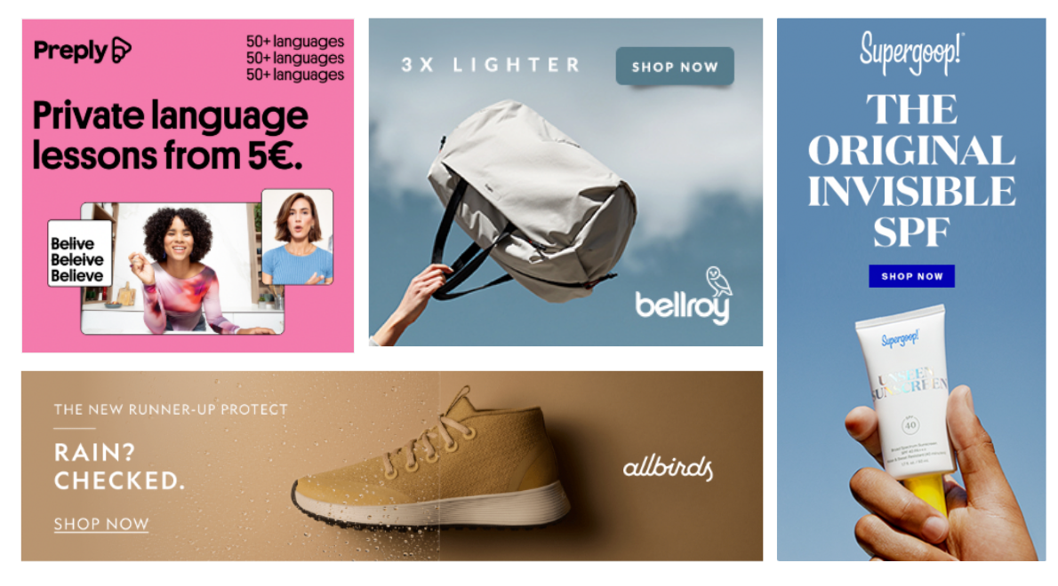
4. Present A Crystal Clear Value-Proposition
Your value proposition is the hook that gets users to click on your ad. It should immediately communicate what makes your product or service stand out—whether it’s an innovative feature, a competitive advantage, or an irresistible offer. Ask yourself: Why should someone choose you over the competition? The answer should be the most prominent element in your ad, grabbing attention within seconds.
The examples shown illustrate strong, clear value propositions that make their offers instantly compelling. Preply highlights affordability with “Private language lessons from 5€”, reinforcing accessibility and value.
Bellroy focuses on a standout product feature, emphasizing its bag is “3X Lighter”, making weight-conscious shoppers take notice.
Supergoop! confidently positions itself as the “Original Invisible SPF”, instantly differentiating from competitors.
Allbirds cleverly uses a visual split to reinforce its product’s waterproof feature with the line “Rain? Checked.”, proving functionality in just two words.
Each of these brands ensures their core message is the first thing the viewer notices, making their ads compelling, concise, and conversion-driven. Your value proposition should dominate your ad space, ensuring users immediately understand why they should click.
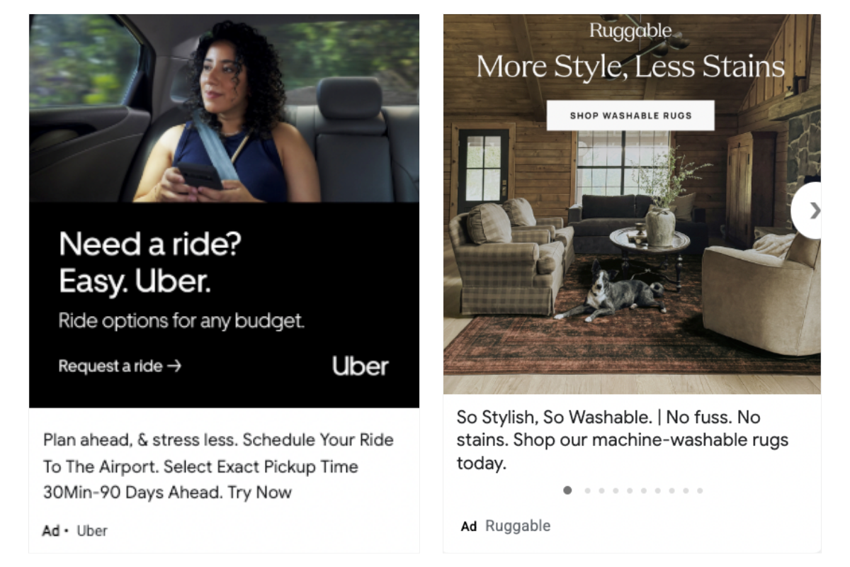
5. Choose An Enticing Call-to-Action
Having a clear CTA is crucial in display ads—it guides the viewer on exactly what to do next. While simple CTAs like “Learn More,” “Shop Now,” or “Sign Up” work well because they are direct and familiar, you can also use this space to reinforce your value proposition.
Uber’s “Request a Ride” is even clearer than a generic “Sign Up” since it tells users exactly what they’re getting. Similarly, Ruggable’s “Shop Washable Rugs” not only prompts action but also highlights the brand’s key benefit—washability—in just three words. A well-crafted CTA does more than direct; it adds meaning and reinforces why users should take action.
6. Keep Your Designs Simple
The KISS rule (Keep It Simple, Stupid) is a fundamental principle in digital display advertising. Users are scrolling quickly, often giving ads just a split-second glance. In that time, they should immediately recognize your brand and understand your core message. The more visual clutter or excessive copy, the harder it is for your message to stick. A simple, focused ad is far more effective than one overloaded with information.
Great display ads don’t try to say everything at once—they prioritize clarity, strong branding, and striking visuals to make a lasting impression. When design and messaging are streamlined, the ad becomes more digestible, engaging, and ultimately, more effective.

7. But, Make It Clever
While simplicity is key in display ads, that doesn’t mean your ad should be boring. A well-placed clever twist can make your brand stand out, capture attention, and leave a lasting impression—all within just a few seconds. Humor, wordplay, and unexpected phrasing can help your ad feel more engaging while still keeping the message clear and digestible.
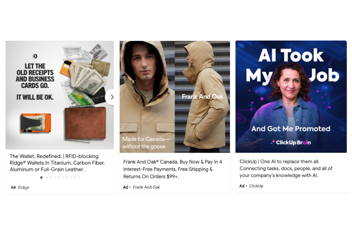
The ads from Ridge, Frank And Oak, and ClickUp prove that simplicity and cleverness can coexist:
- Ridge Wallet plays on the idea of letting go with the line “Let the old receipts and business cards go. It will be OK.” It’s short, relatable, and subtly humorous while reinforcing the product’s minimalism.
- Frank And Oak takes a cheeky approach with “Made for Canada—without the goose”, cleverly referencing its alternative to down-filled jackets. It’s smart and subtle, yet instantly memorable.
- ClickUp uses unexpected phrasing with “AI Took My Job… And Got Me Promoted”—a compelling hook that immediately sparks curiosity and encourages a click.
By keeping copy concise while incorporating wit, irony, or a surprising angle, these brands make their ads more engaging without sacrificing clarity. The key is to balance simplicity with personality, ensuring that your ad grabs attention without overwhelming the viewer.
8. Choose Your Fonts Carefully
Over the years, our paid media agency has seen hundreds of display banners, and one of the most common mistakes brands make is using hard-to-read fonts. Avoid cursive, extremely thin, overly small, or all-uppercase fonts—they can make your message difficult to process, especially on mobile.
Instead, use clear, bold typography to create a strong hierarchy of information. A great way to do this is by playing with font size, capitalization, boldness, and line height to guide the viewer’s eye to the most critical parts of the message. Keep text minimal (ideally under four lines) so that the ad remains visually digestible at a glance.
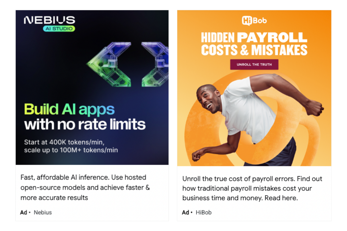
I really like these two examples because they make great use of typography to create a clear visual hierarchy. Nebius uses a modern, bold font with strategic color contrasts, making the key message “Build AI apps” stand out instantly. The supporting description is simple and secondary, ensuring the viewer immediately grasps the most important information.
On the other hand, HiBob keeps it sleek with a single font but hierarchizes information by adjusting boldness and line height. The word “PAYROLL” is emphasized, drawing attention to the core message, while the dynamic typography keeps the ad engaging and easy to scan. This approach not only improves readability but also makes the ad more visually compelling.
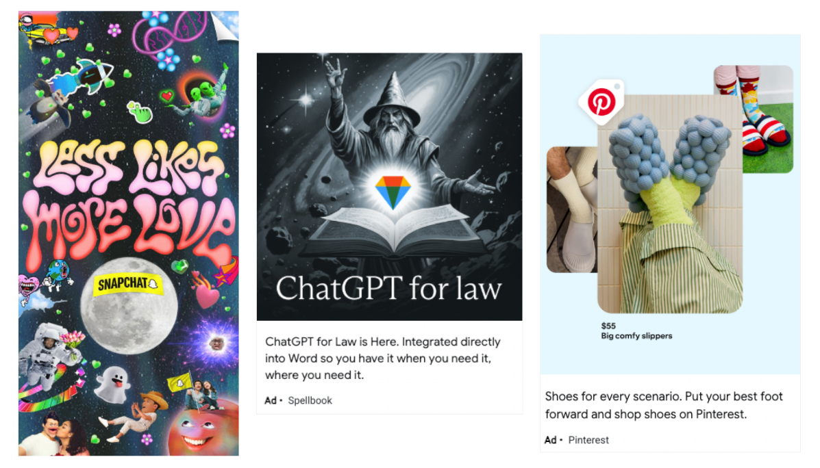
9. Add Strong Imagery
Imagery can make or break a display ad, adding impact and reinforcing the message. Whether using photography, illustration, or bold graphic design, visuals should be purposeful and aligned with the brand’s identity. A strong image grabs attention instantly and helps convey emotion, making the ad more memorable.
The examples here show how imagery can elevate an ad. Snapchat’s psychedelic illustrations reflect its playful, rebellious nature, while Spellbook’s wizard-themed design makes AI-powered legal tools feel compelling and futuristic. Pinterest’s lifestyle-driven imagery showcases quirky slippers in a relatable setting, making the product aspirational yet accessible. Each brand uses visuals not just for aesthetics but to tell a story that resonates.
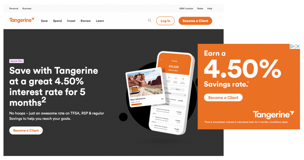
10. Make Sure Your Ad Match Your Landing Page
Your display ads and landing pages should feel seamless, both visually and in messaging. Brand consistency across all touchpoints builds trust and makes it easier for users to recognize and engage with your brand. If your ads look and sound different from your landing pages, you risk confusing users, increasing bounce rates, and lowering conversions.
The Tangerine ad and landing page are a great example of cohesive branding. The ad promotes a 4.50% savings rate, and when users click through, they land on a page with the exact same offer, color scheme, fonts, and CTA style. This smooth transition reassures the user that they’re in the right place, making them more likely to convert.
Beyond visuals, tone and messaging should also align—if an ad highlights a special promotion, the landing page should reinforce that same deal upfront rather than making users search for it. Avoid sending users to a generic homepage, as this can increase frustration and drop-off rates. Instead, ensure your landing pages deliver on the promise of your ad with clear, relevant information that makes taking action effortless.
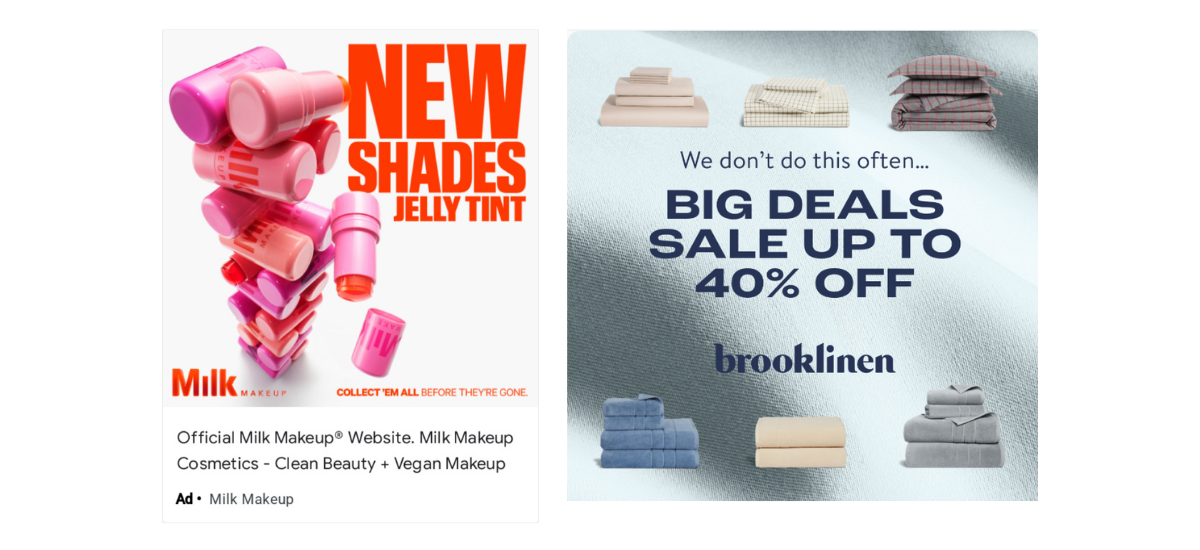
11. Install Urgency
A great display ad doesn’t just grab attention—it pushes people to take action now. One of the most effective ways to do this is by creating urgency through limited-time offers, exclusive deals, or messaging that implies scarcity. When users feel like they might miss out, they’re more likely to click and convert.
The examples here illustrate how urgency drives action. Milk Makeup leans into FOMO with “COLLECT ‘EM ALL BEFORE THEY’RE GONE”, suggesting limited availability and encouraging immediate purchases. Brooklinen reinforces exclusivity with “We don’t do this often…” followed by a bold sale message that emphasizes savings up to 40% off. Both brands use strategic copy and design to make their deals feel time-sensitive and compelling.
12. Make Animated Banners and Static Banners
Animated ads are available on the Google Ads Network. Animated banners are more complex and more costly to produce, but they usually perform better than static images.
That being said, the animated elements shouldn’t distract from your ad’s core messaging. Your animation shouldn’t last longer than 15 seconds. Make sure your core messaging, or at least your brand logo, can be seen in the first few seconds. Plus, your last frame should present a call to action.
Our digital marketing agency suggests testing both formats to see what works better for your brand. Your animated banners need to be in an HTML5 format.
13. Test, Test, Test
Best practices are valuable guidelines, but there’s no one-size-fits-all formula for high-performing display ads. Just because you follow every best practice doesn’t guarantee success—what truly matters is figuring out what works for YOUR brand and audience. The best way to do that? A/B testing.
Simple tweaks can make a big difference. For example, DocuSign has tested CTA buttons with gradient backgrounds vs. solid colors to see which drives more engagement. Meanwhile, Wealthsimple ran two variations of the same message—one with a straightforward, minimal approach, and another with detailed incentive breakdowns—to determine which resonated more with their audience.

By experimenting with different layouts, CTAs, messaging, or even imagery, you can gather real-world data to optimize your ads and maximize performance. Keep testing, learning, and refining—because the best ad is the one that keeps improving.
And, the key to successful A/B testing, is to keep the number of tests to a minimum. Try to focus on one thing, so in the end, you can really pinpoint what made a difference.
14. Explore AI
This is a best practice we weren’t even talking about five years ago, but in 2025, AI has become a game-changer for display ad production. While we don’t recommend letting AI take over completely, when used strategically, it can help streamline production, optimize performance, and enhance creativity.
AI-powered tools can assist with generating multiple ad formats quickly, making it easier to adapt creative across placements without needing a full design team. It can also enhance imagery, creating more eye-catching visuals or testing variations to see what resonates most with your audience.
Need help creating high-performing display ads? Let’s chat! Get a custom proposal or learn more about our creative services.
Subscribe to The Shift Factor
Our newsletter keeps you in the know on marketing’s biggest shifts and real examples of brands adapting.
ABOUT THE AUTHOR
Marie-Joëlle Turgeon
Marie-Joelle works at Bloom, a digital marketing agency, as the Director of Marketing. She's passionate about digital marketing tactics (from social media to web design) for B2B businesses looking to grow online.


Share this: