


User Experience is a field that touches every discipline of digital marketing. Whether you are running campaigns in Google Ads, making on-site recommendations in SEO, or tweaking source code, the end-user needs to be satisfied in order for them to take the action you want them to take. While providing a service that helps the user should always be the first step, even great products that fulfill a real need will fail if users are not considered. Counterpoint, there have also been numerous products out there that serve no real purpose, yet for whatever reason, they resonate with users. At the end of the day, the variables related to success and failure are vast and nearly impossible to quantify in this setting. What we can do is speak to specific user experience rules that can tip the scales in your favour, whether through logic or marketing trickery.
Fitts’s Law
Fitts’s Law predicts that the time required to rapidly move to a target area is a function of the ratio between the distance to the target and the width of the target. In English, this means that it takes a longer time and more effort to interact with something that is far away and small. What this means for modern web design is that important interactive elements that you want users to interact with should be “close” and “large”. What do I mean by close and large? Take a look at Lolë’s product page:


The “add to bag” button (the interactive element), is close to the product and large enough to be easily selected by a mouse. This is a near-perfect example of Fitts’s Law in action.
Hick’s Law
Hick’s Law describes the time it takes for a person to make a decision as a result of the possible choices he or she has. Basically, the more things you need to consider the longer it will take you to come to a decision. One of the most practical applications of this law is in how you construct landing pages. Frequently, landing pages feature multiple links and too much text. This distracts the user, overcomplicates the process, and often leads to them completing an action other than the landing page’s intended action. According to our friends at Unbounce there is a direct correlation between both links:

..And word count:
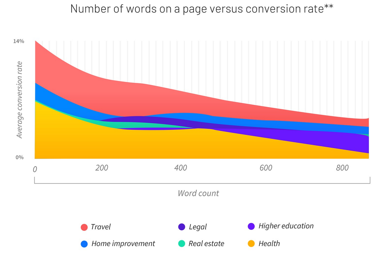
So, keep it simple.
Jakob’s Law
Modern web design is not weather, it is climate. What do I mean by this? Generally speaking users have a template for what an eCommerce website, banking application, or email inbox looks like. Familiar design, the backbone of Jakob’s Law, more or less states that when designing for the web you need to consider that users have a playbook for what to expect based on what they have experienced. Diverting from that playbook is an “enter at your own risk” situation if there ever was one. A common application of this Law is the “F View”. Studies say that users from countries that read from left to right pay more attention to the top, left side, and center of a website more than any other area. Whether this is a caused by common design patterns or a product of it is another question.
Miller’s Law
Miller’s Law derives from one of the most highly cited papers in the field of psychology, “The Magical Number Seven, Plus or Minus Two: Some Limits on Our Capacity for Processing Information”. This law states that most people are only able to hold between five and nine items in their working memory. The implications for this are broad, but when focused on the field of user experience it is very applicable to the eCommerce experience. A prime example of this is the great debate between infinite scroll, pagination, and show/read more. If one were to inform themselves using this rule, it would be immediately clear that the best practice recommendation, without testing, would be to recommend solutions based on either pagination or show/read more options. This is because infinite scroll allows users to become overwhelmed and overexposed to products and potentially forgetting or disregarding new products due to having too many options.
Parkinson’s Law & The Zeigarnik Effect
If you have heard the old adage, and myth, that a goldfish only grows to the size of its tank than you already have a strong grasp of Parkinson’s Law. Parkinson’s Law states that “work expands so as to fill the time available for its completion”. The most practical, and common, application of this rule is to incorporate timers on landing pages. Likewise, The Zeigarnik Effect is another law that uses this type of method to coerce users. The Zeigarnik Effect states that people remember uncompleted or interrupted tasks better than completed tasks. Much like a timer, a creative marketing can use progress bars to move users down the funnel towards conversion.
Conclusion : Laws of UX
User experience is one of the core tenets of Conversion Rate Optimization. By ensuring a strong user experience you put your users, and hopefully customers, on the path towards mutual benefit where users feel rewarded for interacting with your product and you, the service provider, can operate with a sense pride in knowing that your product not only resonates with the end user, but is operating at maximum potential.
To learn more about best practice for conversion rate optimization read about five best practice strategies to increase conversions on your landing pages and websites today on the Bloom blog.
If you need help building landing pages or optimizing your conversion rate, get a custom proposal here.